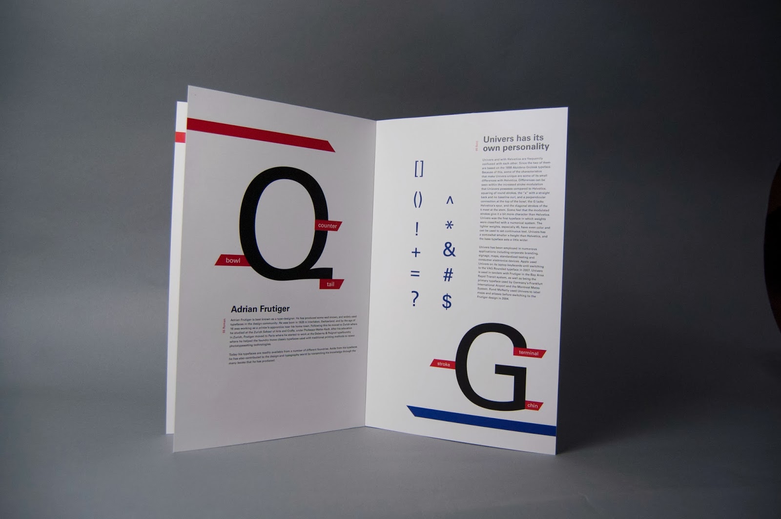
Fixed some layout issues as well as the hierarchy of the composition. Basically, I simplified the image and tried it to make it a little bit more interesting while allowing each element to have their how space to let the eye flow in a more comfortable way while looking at it.
Sunday, December 8, 2013
Friday, December 6, 2013
Wednesday, December 4, 2013
Univers Specimen Book: Pre-Final Critique
Sunday, December 1, 2013
Visual Interview - Refinement
At this stage I am very happy with how successful my concept is by communicating the personality and essence of my client; Mercedes Padro. During critique I got very useful feedback which I tried to use for this refinement phase. Some of those changes where: the incorporation of the patter in the two sides, removing the rectangles that were containing the type. The type in the back panel is now easier to see, the type in the front panel now sits harmoniously inside the image circles without being to hard to read. I also added a few words in french which speaks to Mercedes's passion for the renaissance and impressionism.
Viscomm 1:5 - Concept and Idea development in process
My main goal for this project is to illustrate or communicate the sound of "The Only Ones" by designing it in a way that contradicts the music genre but in a way it also coexists with it so it can communicate the message properly. That is why I am trying to use simplified design while contrasting it with the idea of the musical properties of the band.
Here is something that I've been working on:
For this one I was influenced by the swiss school of design. I was aiming for something simple and structured that its not particularly accurate to what the band, and yet it allows the viewer to experience or form an idea of the musician in their minds.
Here is something that I've been working on:
For this one I was influenced by the swiss school of design. I was aiming for something simple and structured that its not particularly accurate to what the band, and yet it allows the viewer to experience or form an idea of the musician in their minds.
This next one is more type-oriented, I decided to be more expressive with this one. The design communicates the messy and emotional of the band through the handwritten letterforms and the un-structured layout of the same, this way also communicating revelry and anarchy which is a big element in punk rock music. Because the band is formed by 4 members I decided to highlight the four vowels in the name of the band to imprint this idea. For this, idea I used happy and fun colors which in a way expresses the mood of their music but in contrast to the black revelrous letters it also says that their music is more that what meets the eye ( or the ear in this case.)
In my last idea I was thinking of how to incorporate the typography with some type of illustration and at the same keep the design simple. I decided to use a simplified illustration that communicates subjective idea of sensuality and voyeurism while at the same time allowing the design to be interpreted in many different, this gives the viewer the freedom to relate to it on a personal/human level. By merging this elements I was attempting to make a design that gives a play to this many forms of design to coexist in a successful manner. The colors say that their music is very energetic and fun but the illustration and the typography serve as a preview of what their music is about.
Monday, November 25, 2013
Visual Interview - Process: Mock ups!
I decided to go for a decorative style that references Victorian textiles. I believe this connects very well to the world of fashion which Mercedes likes so much. I consulted with my client and she seems to like it very much; which leads me to believe that so far I am fulfilling the objective of reflecting the personality of my client. Back its still based on the expressionism showcasing a photo of Mercedes admiring the Water Lilies, I decided to keep just one photo to avoid making the whole peace overall from being to crowded.
Friday, November 22, 2013
The Set - Outcomes
This was a challenging project in many aspects. Troubleshooting for the construction of the beams proved to be the hardest feat. But our group pulled it to together and I am confident in our piece. Besides some craft issues I believe our concept is strong and our idea is direct.
Photoshop Mock-ups
Scale and Plan View
Scale
3/4 inch = 1 foot
The Poster
The Set - Progress
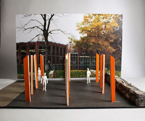
Some progress we made on the project was developing the steel tubes into a trapezoidal shape that connotes a sense of uniqueness that our school has. Some development on the keynote was done and we hope to get supplies for the 3D model and all the images prepared for the poster.
The Set - Final Proposal
We refined and came up with a solid plan that we want to take on. Here are some revisions to our project plan;
Context:
Arrange 13 orange steel tubes in a forest of “columns” to promote community in the right walkway (North side), to catch all passing viewers eyes whether vehicular or pedestrian.
Goal:
Communicate KCAI as bold both in structure and appearance, energetic and tenacious.
Materials:
13 steel tubes
- 13 for the 13 different departments
- Steel for strength
- Height to tower and show power
- 8 ft by 3 in by 8 in
Orange metal paint
- To show the boldness and strength of KCAI
- Reference a school color
32 lights
- Placed on each 3-inch side
- Spaced 2 inches apart
- With one continuous translucent glass panel surrounding
Samantha: Environmental Art Pt. 1 (Final Proposal)
Samantha: Environmental Art Pt. 1 (Final Proposal): We refined and came up with a solid plan that we want to take on. Here are some revisions to our project plan; Context: Arrange 13 oran...
Typeface Specimen Book - Derick Lopez
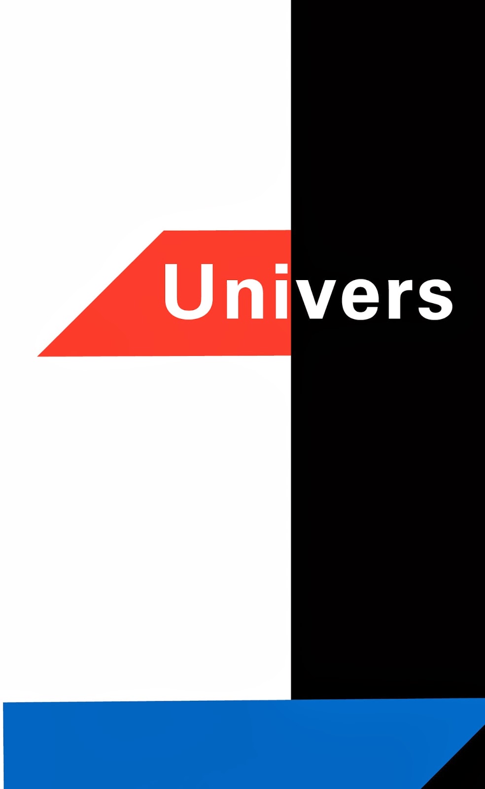
Mainly, I just did some edits; I focused more in the way the lay out of the pages stays cohesive between them. Also tried to make the cover be better related to the contents of the book. I made some small adjustments of some of the elements as well.
And a couple extra covers
Subscribe to:
Comments (Atom)


