Showing posts with label viscommunication 1. Show all posts

Tuesday, March 4, 2014

The Line - Progress


At this point I've kept the illustrations from the early stages of the process. Then, I decided to keep it simple but still try to illustrate the timeline in a way that gave a bit more of information about the subject. Consequently, I came up with the idea of integrating a connotation of the Japanese culture, country to which Ghibli Studio belongs to. Once I got the basic elements defined I some expressive (handwritten looking) typeface to keep the content light-hearted, which is also being reinforced by the color palette. 


Sunday, December 1, 2013

Viscomm 1:5 - Concept and Idea development in process

My main goal for this project is to illustrate or communicate the sound of "The Only Ones" by designing it in a way that contradicts the music genre but in a way it also coexists with it so it can communicate the message properly. That is why I am trying to use simplified design  while contrasting it with the idea of the musical properties of the band.

Here is something that I've been working on:

For this one I was influenced by the swiss school of design. I was aiming for something simple and structured that its not particularly accurate to what the band, and yet it allows the viewer to experience or form an idea of the musician in their minds.


This next one is more type-oriented, I decided to be more expressive with this one. The design communicates the messy and emotional of the band through the handwritten letterforms and the un-structured layout of the same, this way also communicating revelry and anarchy which is a big element in punk rock music. Because the band is formed by 4 members I decided to highlight the four vowels in the name of the band to imprint this idea. For this, idea I used happy and fun colors which in a way expresses the mood of their music but in contrast to the black revelrous letters it also says that their music is more that what meets the eye ( or the ear in this case.)


In my last idea I was thinking of how to incorporate the typography with some type of illustration and at the same keep the design simple. I decided to use a simplified illustration that communicates subjective idea of sensuality and voyeurism while at the same time allowing the design to be interpreted in many different, this gives the viewer the freedom to relate to it on a personal/human level.  By merging this elements I was attempting to make a design that gives a play to this many forms of design to coexist in a successful manner. The colors say that their music is very energetic and fun but the illustration and the typography serve as a preview of what their music is about. 


Friday, November 22, 2013

The Set - Outcomes

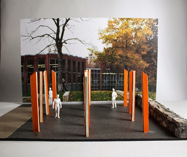
This was a challenging project in many aspects. Troubleshooting for the construction of the beams proved to be the hardest feat. But our group pulled it to together and I am confident in our piece. Besides some craft issues I believe our concept is strong and our idea is direct.

Photoshop Mock-ups 
Scale and Plan View


Scale
3/4 inch = 1 foot


The Poster


The Set - Progress


Some progress we made on the project was developing the steel tubes into a trapezoidal shape that connotes a sense of uniqueness that our school has. Some development on the keynote was done and we hope to get supplies for the 3D model and all the images prepared for the poster.


The Set - Final Proposal

We refined and came up with a solid plan that we want to take on. Here are some revisions to our project plan;
Context:
Arrange 13 orange steel tubes in a forest of  “columns” to promote community in the right walkway (North side), to catch all passing viewers eyes whether vehicular or pedestrian.

Goal:
Communicate KCAI as bold both in structure and appearance, energetic and tenacious.

Materials:
13 steel tubes

  • 13 for the 13 different departments
  • Steel for strength
  • Height to tower and show power
  • 8 ft by 3 in by 8 in


Orange metal paint

  • To show the boldness a­nd strength of KCAI
  • Reference a school color


32 lights

  • Placed on each 3-inch side
  • Spaced 2 inches apart
  • With one continuous translucent glass panel surrounding


Monday, November 11, 2013

Samantha, Marie and Derick: Environmental Art Pt. 1 (3 Proposals)

Samantha: Environmental Art Pt. 1 (3 Proposals): My group is comprised of Derick Lopez and Marie Krikorian. We all have different strengths that work well together. We came up with 3 propos...

Friday, October 25, 2013

Viscom 1:3 Photoshoot phase 1


Energetic and dynamic.


 Confident, dependable and elegant


 Harmonious, dynamic and fun


Monday, October 21, 2013

Viscom 1:3 Progress.

These is what I've got so far, they are vector based. The word that is constant between the three of the is dynamic, they all have very nice movement and entertain the eye effectively. Although they could use some finesse. I still have some scan and photo based options to pending to be made.


1 Color

These one seemed to be the most successful during the critique, it transmits it contents in a harmonic and clean way. Still some thought that a darker tint of green/blue would work better, so I will have to try that out and see how it goes. 


3 Color

These one is my least favorite, even tho I tried to push the design the way it turned out to be seemed to aggressive from a marketable level. The way the pills where pouring down had somewhat of a implicit idea that isn't healthy for the costumer. I used a more traditional typeface while attempting to make the design elegant but I guess that it doesn't quite contrasts with the cheesy illustration.


Multicolor

This is my favorite out of the three. I feel like I pushed some design boundaries en ended up with a very nice looking piece. I think that the design looks very modern and sophisticated and transmits information in an organized and out of the ordinary thinking fashion. Some of the critics gave me some insight about simplifying some of the sides of the packaging and I agree with those so I'll look further in how to improve it.


Monday, October 14, 2013

Viscom1:3 Packaging so far

So here are some of the redesigns for the Nyquil packaging. I Tried to stay very sophisticated with the first 2 but in the third one I got a little crazy and decided to go for something more commercial using some gradients and 3d shapes.


Design in 1 color


Design in 3 colors


Multicolor Design 


Monday, October 7, 2013

Viscomm Evaluation

What I have to say about my experience in this class... Well, I feel that I've learned a lot specially when I have the chance to put my knowledge into practice. I feel that I could start trying harder to make better quality work but, I also feel that I am understating quite well the information that I am being given. I think I have done a fairly good job in my projects, yet some of the critics end up being quite confusing and vague, as well as not knowing if wether at the end of the project I did or did not a good job. Some of these information could help me as a motivation to either step it up or to work even harder. Once again I expect to keep improving and to start trying harder, but still, a little extra feedback would come in handy.

Thursday, October 3, 2013

Viscom 1:2 Progress

So here are the designs that I will present to my client, Edith Galicia. I tried to focus on the on her interest in the 90's art style which is very active and dynamic. Also she enjoys 
hip-hop music very much but also likes some good old rock'n roll as it is JNSN. She is also very organized, clean, but its not afraid to get her hands dirty. She has strong convictions and desires, as well as a very proactive personality.

So here are the designs that I came up with.


Monday, September 30, 2013

Viscom1:2

So for this project I have to make a mark using the initials of my classmate; Edith Galicia. So I gathered some personal information about her to help me create the design.

What I've discovered: 

She is 20 years old
Middle child
Her favorite font in Futura
She likes the Urban/Graffiti design style from the 90's
She loooooooooooooooves elephants
Her Favorite color is Purple 
Her hobbies are swimming and sleeping.
Her favorite musician is JNSN

So, i think I've got enough information to work with.

Monday, September 23, 2013

Viscom 1:1 Almost There!

This is the final result of the Visual Order project. I truly learned a lot through this project and enjoyed having the chance to explore some visual laws and experiment with them.


Monday, September 16, 2013

Viscom1:1 Progress - Simmetry and Re-makes Pt.1

So here are the new designs for the simmetry laws and also for the figure ground which is the one that I was missing. I decided to use a tint of red to make the designs more interesting, and also to create an overall identity through the whole project. So far I feel very satisfied with these results, I will be re-making the ones for the Gestalt Laws during the course of the week and replacing some of the photos to better illustrate the theory. 

Figure/Ground


Reflection


Glide Reflection


Rotation


Translation


Dilation