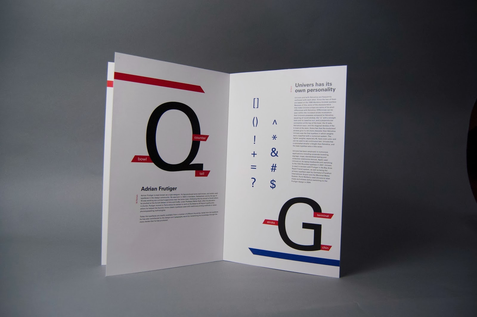
Fixed some layout issues as well as the hierarchy of the composition. Basically, I simplified the image and tried it to make it a little bit more interesting while allowing each element to have their how space to let the eye flow in a more comfortable way while looking at it.
Sunday, December 8, 2013
Friday, December 6, 2013
Wednesday, December 4, 2013
Univers Specimen Book: Pre-Final Critique
Sunday, December 1, 2013
Visual Interview - Refinement
At this stage I am very happy with how successful my concept is by communicating the personality and essence of my client; Mercedes Padro. During critique I got very useful feedback which I tried to use for this refinement phase. Some of those changes where: the incorporation of the patter in the two sides, removing the rectangles that were containing the type. The type in the back panel is now easier to see, the type in the front panel now sits harmoniously inside the image circles without being to hard to read. I also added a few words in french which speaks to Mercedes's passion for the renaissance and impressionism.
Viscomm 1:5 - Concept and Idea development in process
My main goal for this project is to illustrate or communicate the sound of "The Only Ones" by designing it in a way that contradicts the music genre but in a way it also coexists with it so it can communicate the message properly. That is why I am trying to use simplified design while contrasting it with the idea of the musical properties of the band.
Here is something that I've been working on:
For this one I was influenced by the swiss school of design. I was aiming for something simple and structured that its not particularly accurate to what the band, and yet it allows the viewer to experience or form an idea of the musician in their minds.
Here is something that I've been working on:
For this one I was influenced by the swiss school of design. I was aiming for something simple and structured that its not particularly accurate to what the band, and yet it allows the viewer to experience or form an idea of the musician in their minds.
This next one is more type-oriented, I decided to be more expressive with this one. The design communicates the messy and emotional of the band through the handwritten letterforms and the un-structured layout of the same, this way also communicating revelry and anarchy which is a big element in punk rock music. Because the band is formed by 4 members I decided to highlight the four vowels in the name of the band to imprint this idea. For this, idea I used happy and fun colors which in a way expresses the mood of their music but in contrast to the black revelrous letters it also says that their music is more that what meets the eye ( or the ear in this case.)
In my last idea I was thinking of how to incorporate the typography with some type of illustration and at the same keep the design simple. I decided to use a simplified illustration that communicates subjective idea of sensuality and voyeurism while at the same time allowing the design to be interpreted in many different, this gives the viewer the freedom to relate to it on a personal/human level. By merging this elements I was attempting to make a design that gives a play to this many forms of design to coexist in a successful manner. The colors say that their music is very energetic and fun but the illustration and the typography serve as a preview of what their music is about.
Subscribe to:
Comments (Atom)


