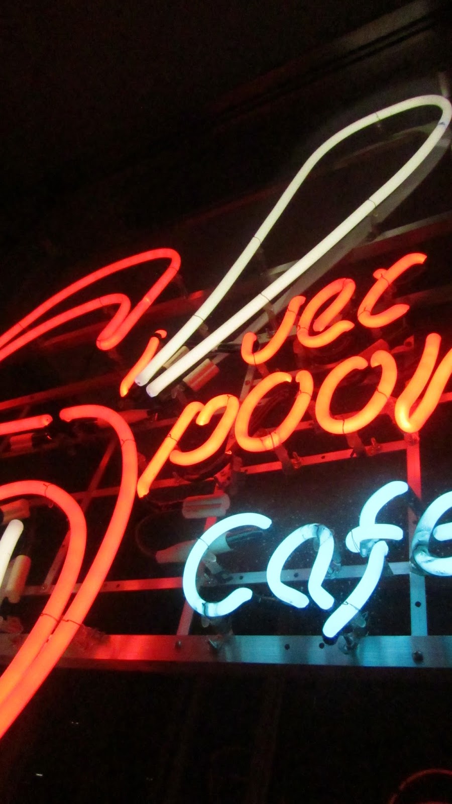
These are some of my choices for this project; the photos should have the colors that represent a specific color scheme i.e. Split-complimentary. This will not be the final slides but they will serve me as a reference. Many things will be changed for sure.
So here are some marks that I've been working on, I tried to make them say something about myself. For the next step I have to pick 3 out of them (which are the ones with the blue mark next to it) and make a few iterations of them. Wish me luck!
Here are some of the ideas that I've come up for this project. I identify myself a lot with the use of thin lines or constructed solid shapes, still sometimes I let myself get really elaborate.
So the subject I decided to use was "Lights". I really think lights are particularly captivating when you can see them, by themselves, in the dark. To me it feels like they have their own personality and that if you stare long enough at them and forget that they are there just to get your attentions, it is easy to appreciate their beauty. Here are some of the photos that I took last weekend, they are all unedited so far, but I am working on that.
These are some photos to illustrate the simmetry principles of this assignments. Simmetry seems a little beet more complex to recognize when it is not perfect simmetry. So here are some examples:
Glide
Translation
Reflection
Rotation
Dilation
So like I mentioned earlier, I decided to take Futura back to its architectural origin, so I decided to go for a design that resembled architectural schematics. I drew some guidelines, and tried to make write the name of the parts of the letterform I and a handwriting style that resembles the one from an architect. For the same reason I decided not to fill the strokes of the layer with black and leave them as thing black lines, I added some dotted lines to add to the concept of architecture. Since the font was commissioned by the Bauer House Foundry, at a time where architecture and education were being revolutionized; I decided to roll the top of the piece of paper to convey this series of ideas.
Here are the designs that I am going to use to represent each Gestalt Laws as well as their definitions. I my best to avoid making all the images in a minimal style, which is something I tend to do very often. I feel like I converged the meaning of each definition in the layout of the pages.
Similarity
Proximity
Continuance
Closure