Wednesday, September 30, 2015

Cultivate KC?~Rapid Prototyping

The first prototype idea: is to create a marketable brand system. The system will consist of material for handling the food that the local farmers and growers can utilize to identify their products and to create presence for what they do in a broader community range. Some of this branded items could be small vegetable containers that can be reutilized to grow plants this way perpetuating the idea of urban growing and sustainable practices. 


The second prototype idea: Is to create an app that would allow the farmers and members of community gardens to keep a better track of their crops in useful ways. This will make their process more practical, efficient and easy to do. By making things easier they are also encouraged and enabled to integrate their product and culture into their community. This way making the idea of local farmers and urban growers more appealing for other people to adopt and include themselves into this practice. The App offers multiple options such as data sharing and input to keep track of the crops. As well as options to share the food in various ways such as gifts, selling and cooking them for activities in their communities. (aside from the general social media sharing.)


The third idea: A website which provides similar tools from the app. The website design takes it a step further in functionality and interactivity. By implementing the usage of a map the users can have an immediate idea of the locations where other people that they can interact with are located. In regard of interactivity, in the events page the circles will have varying sizes, these sizes have a relationship with the time of the event and a the visual metaphor of "growing" vegetables. The bigger the circles, the sooner time/date of the event. These interactive elements are meant to offer relevant information in a more immediate fashion, this way the user can have a clearer understanding of each element in each page.


Tuesday, September 29, 2015

Reliquary: Progress, Logo refinement and supporting elements.

MY INITIAL IDEAS dwelled within a very ornate spectrum which defeats the vision of humility. So I decided to pull back, and simplify its features.


THE REFINEMENT consisted I simplifying the typography as well as creating a seal, that even tho can be an ornamental element it doesn't necessarily strikes as something expensive or too official. It functions more of a symbol built of elements related to the topic of traveling and exploring.
The sketches for supporting ideas are based in thin lines creating pictures of places, which plays off of the idea of traveling. The lightness and imperfection of the lines refers back to the aspect of humility and the human touch. My only concern with the lines is that might seem disconnected from the vector perfect seal and type. Although if I eventually find this idea promising I might modify the rendering quality of the type and seal to a more handmade brand.


THE COLOR PALETTES attempt to emulate nature and the idea of the ethereal and epiphany. Maybe soft colors dominate and darker tones create accents? Sounds logical, I believe.


Sunday, September 27, 2015

Cultivate KC: Progress + Reading responses

THE BIG PICTURE:
The big pictures so far, is to create a system of tools that would enable the growers and farms to keep better track of the crops and cultivations within their communities. This way increasing the success rate of such projects, which will be more efficient and attractive for other neighborhoods to take in account these kinds of projects. 
So far one of this ideas is something in print which the farmers/growers can scan with their phones and give them easy access to information regarding the cultivation process. 
Our next step for research is to figure out the technical aspect and logistic of our ideas and plans.
The audience feedback will come after we define our idea with more clarity. Said feedback will come, first - from the growers and farmers to gather knowledge about what kind of data or process they would need more efficacy in. Second - The neighborhood members, ask the what motivates them to go outside and socialise with their community, what kinds of activities, places, etc.

Research on QR codes:
http://blog.hubspot.com/blog/tabid/6307/bid/29449/How-to-Create-a-QR-Code-in-4-Quick-Steps.aspx

https://econsultancy.com/blog/64891-six-mobile-marketing-alternatives-to-qr-codes/

RESPONSES:

Re: He might be giant...

"I'm a dork. I'm aloser. I'm not cool at all. Everybody just projects their idea of what's cool on me. I'm boring. I never go out. I don't know what'ship in music right now or anything."

I feel like I identify with him in many ways and that I have come with his way of thinking in several instances in life. In fact, one of the reasons why I hate packaging design is because it is a factor in the idea of mass consumption, in which quantity that only makes the people's bodies and minds unhealthy, is more important that quality. Than trying to improve people's life in some way. Also the case in which I feel so uncomfortable in relationship with trends, they can be beautiful and all but when used in an arbitrary fashion just to appeal to the public's sense of POP and aesthetic desire then it becomes easily worthless, empty and selfish for the sake of the designer's craving for attention.

finally this: "saying he doesn't care whether people love him or hate him, as long as they respond to what he's doing." I need to learn some of this, so I can me more of myself, and who I want to be.

Re: Kale Lasn

The issues that are typically solved with a common an easy solution can be more expensive than its benefits. Taking in consideration the human factor and not just the economical one. Then if we consider this we can come up with solutions that improve the first one, or maybe that are completely different. 

'I think we designers have to pay more attention to that second kind of product—the one that, for years, maybe decades, maybe centuries will delight, ease, charm." Again quantity vs quality becomes an issue, people care too much about money, keeping up with the appearances, titles and materialism, and too little about the people they are selling things to. IE beat headphones have a material cost of $45 USD and are sold for hundreds of dollars, and this is because they only care about money, and the consumer about appearances, which is an incredible stupid and careless behavior that isn't healthy for the consumers.

"As the planet degrades, I think a slower, greener, less-cluttered, and less-commercial aesthetic
will emerge." At the time being, I have noticed several companies and designers have started being more caring about their peers and try to improve their lives, but I think it is unnecessary to reach a extreme situation in which people's desperation, pain and suffering are the reason for this change to come.

"Bio-mimicry is mimicking nature. I think it's one of the key aspects of future product design.
It's already popular in architecture and some other professions. In design, bio-mimicry would involve
looking at how nature does the same job as the product you are designing." Human-like qualities guiding design not only informs the designer about the intentions of the design but allows them/us to get more involved in what we do and to empathize with an audience and then they can also connect with us, as individuals as human beings. A commonality that can lead to a brighter future on a global scale.


"We can carve out a soul for it beyond its current commercial masturbation." Again contemporary overused trends are sucking our souls, products of commerciality and the material. Indiferent of the human beings, some designers use it as easy solutions for their design problems and care little about devising new ways to approach people instead of businesses. 


Wednesday, September 23, 2015

Branded Package: Defining Reliquary

So the name I chose was reliquary I found that its closely intertwined with  the other name that I liked, Pilgrimage. The definition of pilgrimage is: a purposeful journey in search of a meaning or relic. So there, that's the connection. I decided to chose the idea of the relic and take it away from a religious context and adapt it to a more individual definition of treasure, of reaching satisfaction. What is valuable to people and what is in reality valuable , more than just the material.

For the research I tried to approach why aromas in essential oils have an effect in the well being and of individuals.

Aroma Research: From The Fragrant Mind: Aromatherapy for Personality, Mind, Mood and Emotion by Valerie Ann Wornwood.

On the effect of aromas: 

Life is hard and being negative is easy. But staying sane is relatively easy and is key for enjoying life in whatever way is best suite for us as humans, and as intellectual and emotional individuals.

Essential oils infused with aromas have great beneficial effects in the well being of individuals. In aspects such as physical, emotional and intellectual (memory, calm mind). 
Some of the most important factor that it affects (in relation to my research) are happiness, confidence and efficiency. Said factors build on the mood in which each individual apparatus life.

The sense of smell: when the aroma molecule hits the olfaction receptors on the cilia of the olfactory bulbs, they are actual connecting with a part of the brain. The olfactory bulbs are embedded in the "limbic system," a part of the brain that deals with, among other things, memory. Usually we experience this connection passively, when an aroma reminds us of something that happened in the past. In aromatherapy we use this connection in an active way, by stimulating the memory to recall information we previously experienced.

SOME PRELIMINARY SKETCHING:


Tuesday, September 22, 2015

KC city pride: Progress

We revisited our previous mobile wireframes and added a few more screens. We've also picked a location for our kick starter event (3rd Platform) and started to imagine the way the space will be organized. We choose the West Bottoms because we think that's a location that needs some attention and it's just logically works providing enough space. Our next steps are to incorporate the mobile app into the event space. We are going to have beacons set up at the entrances of the event that will pop up options to use at the event, such as coupons & uploading photos.


option one:
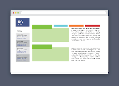
have things physically organized like they would be on a website, into categories. So having one location for food, etc. This makes for easy navigation but not much intermingling with different companies.


option two:
have things all mixed up and incorporated together, more like a fair or something.
This kinda goes off our goal for people to discover things they wouldn't normally go up to.
But the problem is that it could get confusing & difficult to navigate.

Sunday, September 20, 2015

KC city proud: Building up an idea

I have an idea in which mobile devices can interact with the space that we are trying to build, to serve as tools or extensions that empower the users and the sponsors to connect with each other in a much easier and efficient way while at the same time maintaining human interaction as the main avenue for the final result.

An idea could be to place beacons or codes that the users can scan in relation to a particular business or maker. Then, an app or some kind of software compiles the behavior of interest of the user (they like country music, BBQ, and long walks on the beach.) Then the software creates patterns which promotes other businesses, activities or products that relates to the taste of the user. This way, promoting exploration of local made talent and product while at the same time contributing to our final goal which is unifying local made things to create a much wider and stronger culture that is more inclusive and sensible towards the needs of a more general KC population.


Friday, September 18, 2015

Packaging: Moodboards

The objects/artifacts I want to do are body-wash, shampoo and deodorant

Name options:
Moratorium, memento, nomad/dic, pilgrim/age, Journey, Relic/quary, Convergence (ocean), Departure, Wend, Serendipity, Addio/Adieux


The first mood is based in a traveling experience, of a product that transport you to places through smell. And a visual experience in the packaging. But it isn't just like any travel is a purposeful one, a journey that serves as a moment's peace in the agitated life of a person or a ritualistic practice.

The second mood is based in the the modern-classic life. The product comes from a variety of ingredients and techniques from around the world while the visual application might have some level of spirituality or cultural background.


Tuesday, September 15, 2015

Branded: Game Cafe

As the final result I ended up with something I felt is strong. It is meaningful in the way it conveys the attributes fun, friendly and inclusive. The logo ended up being very versatile which is something I wanted to achieve. By doing so the brand is capable to be tailored for all different tastes and fictive worlds. Nonetheless I stablished basic guidelines in the style guide which allows for the brand to be used consistently and effectively. This can be seen in the digital applications of the brand where it has a personality whilst serving a purpose of practical satisfaction towards the client's and the user's needs.

My only regret is that I feel there is a missing link that, like it lacks impact on its accuracy (not 100%) to tell the viewer what it is exactly about.


Sunday, September 13, 2015

Visual Advocacy: Cultivate KC

Research:

After meeting with Claire we found that they have many needs and their organization is at an expansion point. This makes it harder to address what of their needs in particular we want to address.
Yet there is a lot of possibility to contribute something to what they do, but then again "only promise what you can give."

Statement/question:

What is the most important/practical/effective thing that we can do to help them. Which ones of their needs and objectives do we want to solve.

Audience:

The audience is very varied, since it isn't necessarily an specific demographic or community to target. Rather there is a wide variety of individuals with different traits and interests yet the common multiplier is CUltivate KC. There is more research to be done how how to bridge and bond these individuals.

Behavior to change:

We want to encourage individuals to join the cause and to commit to a purpose of growing and consuming local food.

The measure:

Leaving a visible change/difference, maybe???

More questions-----------
We are trying to help cultivate KC, local farmers, food growers and food providers.
We try to reach members in the communities near vacant lots to commit and contribute to the cause.
The stakeholders are the members of the organization, members of the communities who are involved, food service providers that utilize these kinds of foods, government entities associated with the cause (land bank, etc)
The benefited ones will be the communities that have access to a more healthier food source as well as the development of their communities infrastructure.
The ones being affected negatively may be some business whose profit may be lowered due to the lack of demand of their products.
Their needs are wide and varied. Since they are expanding at the moment and they have so many issues or areas to tackler its hard to address which connection to the vacant lands we want to address during the time being.

More In progress..... soon

Problem Statement: KC city local proud

Problem Statement: There is a disconnect between local communities in the KC area. The area has become very prideful community as a whole, but there are many sub sections of the community that could benefit from connecting with each other. 


First we made a mind map to see what sub-categories we could focus on fleshing out


Then we we reorganized the information into a site map, choosing fewer over arching tabs on a potential website or app. 


Friday, September 11, 2015

Branded: More exploration

At the moment I am trying to figure out a way to make my linework concept work better, to have  a greater range of aesthetic value and capability. So I tried different ideas, there is something in its simplicity that needs to remain unchanged and through this train of thought I am getting more clarity to how to make it work either on its own or paired with the 3d concept.


Wednesday, September 9, 2015

MX KC city Proud: Introduction/Business cards


MX KC CITY PRIDE: WIREFRAMES

ITS ABOUT FUNCTIONALITY.  At the moment I wanted to make sure that the essential functions for a learning experience where organized and practical. I want  it to be clean to be capable of sophistication and follow design trends intended to create culture. The frames go from landing page>section page>and article page.


Tuesday, September 8, 2015

BRANDED: GAME CAFE - 3D

After cleaning up some details to improve legibility I started creating stories and places were the themes of the games are imbued. Ultimately I wanted the logo to be versatile and capable of interacting with the imagination of the viewer.