Monday, September 30, 2013

Viscom1:2

So for this project I have to make a mark using the initials of my classmate; Edith Galicia. So I gathered some personal information about her to help me create the design.

What I've discovered: 

She is 20 years old
Middle child
Her favorite font in Futura
She likes the Urban/Graffiti design style from the 90's
She loooooooooooooooves elephants
Her Favorite color is Purple 
Her hobbies are swimming and sleeping.
Her favorite musician is JNSN

So, i think I've got enough information to work with.

Final Poster - Miguel de Cervantes

This is the final version for the poster, I had some troubles with the printing maybe due to color balance or file format so I might fix that in the future. I think in made a big improvement from the first version and removed the brick wall that was creating too much noise in the composition. I also think that I could balance the quote a little better. Aside from thus fixable details I fell that I accomplished the mission to create a recognizable poster  that objectively represented my subject. 


Wednesday, September 25, 2013

Quote Interpretation

So the quote that my partner and I chose is "Good design is obvious, great design is transparent" by Joe Sparano. I like this quote very much in a sense that it expresses very well and clear the idea of always taking a extra step in Design. The way I understand it is that great design is easy to recognize and you can notice it right away, basically is what you see first in a design which is the obvious. Great design will be in the details, the subtlety of the designs and all those elements that can only be recognized through a high knowledge of the matter that the design represents or through careful observation. It is those small details that add an extra something to the design and makes it special, or great design. So like I said, I like this quote very much because I think it has great significance and also great potential for a great design. Not just by the idea that it communicates but also because of its deeply and complex reference to what Graphic Design is about.

Monday, September 23, 2013

Viscom 1:1 Almost There!

This is the final result of the Visual Order project. I truly learned a lot through this project and enjoyed having the chance to explore some visual laws and experiment with them.


Tuesday, September 17, 2013

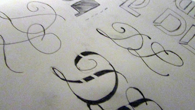
Final typgraphic mark and some alternatives

For the final piece I wanted to stay true to the deliverance of the font (Chaparral) that its clean and airy simplicity. Although, I decided to step away from its square/angular attributes from and focus more in the flow and interesting curve in the "D" letter, so I tried to use that in my favor. I also got rid of the bracket, in the end I had a mark that had nothing to do with my primary reference I guess the more I got to know the typeface the less I identified with it; so I had something more similar to Bell Gothic or Helvetica which seem to be fonts that I feel better connected to. Still experimenting with Chaparral helped me discover and explore some ideas that I would probably not think of if I had started with Helvetica right off the bat.  

So the statement that I want to make with this mark is that it isn't boring, and has a lot to say. It shows wonder and harmony, looks like an organism with many possibilities and great potential. It is friendly and playful; still,  it shows character and conviction. 
And what I like the most is that it its modest with no cheese all over it, and this is one of the things that I strive the most to be; humble.
So yeah, I feel very pleased with this final result, but still I wold definitely like to experiment with this same train of thought in the future.


Monday, September 16, 2013

Viscom1:1 Progress - Simmetry and Re-makes Pt.1

So here are the new designs for the simmetry laws and also for the figure ground which is the one that I was missing. I decided to use a tint of red to make the designs more interesting, and also to create an overall identity through the whole project. So far I feel very satisfied with these results, I will be re-making the ones for the Gestalt Laws during the course of the week and replacing some of the photos to better illustrate the theory. 

Figure/Ground


Reflection


Glide Reflection


Rotation


Translation


Dilation


Friday, September 13, 2013

Typography Marks/Identity Continuations.

After using three of my previous made marks, I had to make 5 iterations for each of those. So here are some of my options from which I will have to choose just 1 to continue further on the project.  


Wednesday, September 11, 2013

Images and Color Schemes

These are some of my choices for this project; the photos should have the colors that represent a specific color scheme i.e. Split-complimentary. This will not be the final slides but they will serve me as a reference. Many things will be changed for sure.


Typography Marks - The Beginning

So here are some marks that I've been working on, I tried to make them say something about myself. For the next step I have to pick 3 out of them (which are the ones with the blue mark next to it) and make a few iterations of them. Wish me luck!


Tuesday, September 10, 2013

Type Identity - Process

Here are some of the ideas that I've come up for this project. I identify myself a lot with the use of thin lines or constructed solid shapes, still sometimes I let myself get really elaborate. 


Project 2 - Subject/Theme

So the subject I decided to use was "Lights". I really think lights are particularly captivating when you can see them, by themselves, in the dark. To me it feels like they have their own personality and that if you stare long enough at them and forget that they are there just to get your attentions, it is easy to appreciate their beauty. Here are some of the photos that I took last weekend, they are all unedited so far, but I am working on that.


Monday, September 9, 2013

Viscom 1:1 Pt. 2

These are some photos to illustrate the simmetry  principles of this assignments. Simmetry seems a little beet more complex to recognize when it is not perfect simmetry. So here are some examples: 


Glide


Translation


Reflection


Rotation


Dilation


Exploring Typography - Final Part

So like I mentioned earlier, I decided to take Futura back to its architectural origin, so I decided to go for a design that resembled architectural schematics. I drew some guidelines, and tried to make write the name of the parts of the letterform I and a handwriting style that resembles the one from an architect. For the same reason I decided not to fill the strokes of the layer with black and leave them as thing black lines, I added some dotted lines to add to the concept of architecture. Since the font was commissioned by the Bauer House Foundry, at a time where architecture and education were being revolutionized; I decided to roll the top of the piece of paper to convey this series of ideas.


Thursday, September 5, 2013

Viscom 1:1 Pt.1.5

Here are the designs that I am going to use to represent each Gestalt Laws as well as their definitions. I my best to avoid making all the images in a minimal style, which is something I tend to do very often. I feel like I converged the meaning of each definition in the layout of the pages. 

Similarity


Proximity


Continuance


Closure