Monday, November 25, 2013

Visual Interview - Process: Mock ups!


I decided to go for a decorative style that references Victorian textiles. I believe this connects very well to the world of fashion which Mercedes likes so much. I consulted with my client and she seems to like it very much; which leads me to believe that so far I am fulfilling the objective of reflecting the personality of my client. Back its still based on the expressionism showcasing a photo of Mercedes admiring the Water Lilies, I decided to keep just one photo to avoid making the whole peace overall from being to crowded.


Friday, November 22, 2013

The Set - Outcomes

This was a challenging project in many aspects. Troubleshooting for the construction of the beams proved to be the hardest feat. But our group pulled it to together and I am confident in our piece. Besides some craft issues I believe our concept is strong and our idea is direct.

Photoshop Mock-ups 
Scale and Plan View


Scale
3/4 inch = 1 foot


The Poster


The Set - Progress


Some progress we made on the project was developing the steel tubes into a trapezoidal shape that connotes a sense of uniqueness that our school has. Some development on the keynote was done and we hope to get supplies for the 3D model and all the images prepared for the poster.


The Set - Final Proposal

We refined and came up with a solid plan that we want to take on. Here are some revisions to our project plan;
Context:
Arrange 13 orange steel tubes in a forest of  “columns” to promote community in the right walkway (North side), to catch all passing viewers eyes whether vehicular or pedestrian.

Goal:
Communicate KCAI as bold both in structure and appearance, energetic and tenacious.

Materials:
13 steel tubes

  • 13 for the 13 different departments
  • Steel for strength
  • Height to tower and show power
  • 8 ft by 3 in by 8 in


Orange metal paint

  • To show the boldness a­nd strength of KCAI
  • Reference a school color


32 lights

  • Placed on each 3-inch side
  • Spaced 2 inches apart
  • With one continuous translucent glass panel surrounding


Samantha: Environmental Art Pt. 1 (Final Proposal)

Samantha: Environmental Art Pt. 1 (Final Proposal): We refined and came up with a solid plan that we want to take on. Here are some revisions to our project plan; Context: Arrange 13 oran...

Typeface Specimen Book - Derick Lopez


Mainly, I just did some edits; I focused more in the way the lay out of the pages stays cohesive between them.  Also tried to make the cover be better related to the contents of the book. I made some small adjustments of some of the elements as well.


And a couple extra covers


Tuesday, November 19, 2013

Visual Interview - Mercedes: Concept and Sketches

Since Mercedes is a person of many disciplines, faces and perspectives, I wanted to divide the two sides of the fold into two different worlds. On the front the images of her life as a student, her professional desires and aspirations as well as remarking her passion for sophistication and fashion. Two holes will be cut out in panels 1 and 4 that will show an abstract and unidentifiable part of the fold. This serves the purpose of remarking Mercedes thoughts on "showing others the hidden beauty of many things". Son once they pass onto the back side of the fold they can see a different world, based on her influence from the renaissance; this side will focus on Mercedes personal desires, like reading, listening and/or playing to music,etc. 


Specimen book progress: Univers

Following my previous sketches, I wanted to keep the layout of the pages very structured. 
I believe that it sits very well with the idea of stability and precision that is conveyed through Univers. 


Sunday, November 17, 2013

Metaphore

My theme was "relationships", any kind. Not just in the human aspect but also in the personal aspect, what do we want, what do we feel alienated from or alienate ourselves from, or what makes us mad and frustrates us. The words that I chose to represent are: desire, detachment and frustration.


Desire is an emotion, that overwhelms our being and eventually ends up reigning over us. it follows us anywhere and everywhere and it can make us do anything. This is the idea that I tried to convey for the design


 Sometimes we disconnect from those things that we thing will harm or hurt us. Some other times we disconnect from things that we want to protect, from us. Detaching ourselves of emotions is something we often do, either because we want to be professionals and avoid interference from our feelings or because we are afraid. The way I portrayed detachment represents the two main parts of our being, the brain and the heart being split in half, separated.

The struggle for clarity, inspiration or ideas. Trying to find an idea or trying to make put things together, at work, school, relationships in life in general. It can be sometimes frustrating. This concept displays frustration in a way that is not completely clear, it is not frustration accompanied by rage but it is holding the hands of depression. It shows the metaphor of what how we feel and thing when we are going through this emotion. It is not an easy thing to overcome.


Visual Interview - Mercedes Pedro

As stated in the title for this assignment I had to interview my classmate, Mercedes. So here are a few facts about her:

She was born on February 1993, in Chicago Illinois. USA. She thinks she have always belonged in Chicago but she has the desire to travel and make art.
When she was young she wanted to work at Disney, and she have always loved art since she was little. She've always wanted to be a writer and illustrate her own books.

Some of her inspirations come from fashion, music, books and movies. Her favorite movie is american beauty, and her favorite quote is "there is so much beauty in the world , that sometimes I feel I can't take it and my heart is going to cave in.

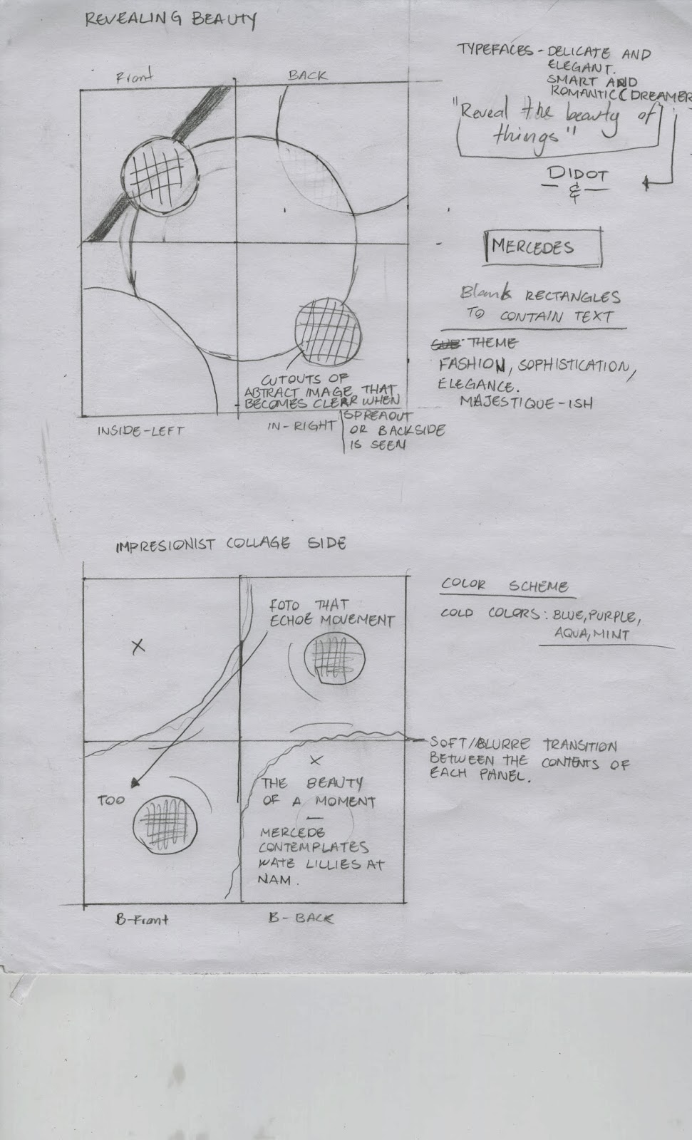
Some of her influences in art art Frida Kahlo, Gustav Klamt, and Impresionist art.

She is modest and it is hard for her to admit many things, like the fact that she is a dreamer. She aims to devote her life to beauty and to make beautiful things. 


Now here is my attempt to write a narrative about her, since she loves books so much I thought that it would be appropriate to tell her story as if it was part of a book itself.
(Disclaimer: I am not a very good writer, nor I have the best grammar)

A short story about Mercedes Padro.

It was 1993, the year. In a cold February, it was the 27th day of the month. In a town called Chicago, in the state of Illinois, USA. That day she opened her eyes and her mother saw in her a light, a miracle, capable of ambition, a dreamer. She saw for her daughter a life, filled with challenges for her to defeat, obstacles for her to surpass, filled with opportunities for her to take, and everything for her to have. The name of the baby would be Mercedes, a name that means mercy, yet it possesses elegance and virtue. Accompanied by her fathers last name Mercedes Padro, the full name it was.

As Mercedes grew up, she learnt to see the world in a different way than anybody else. She saw beauty in what everyone thought were ordinary things. She understood that the beauty of things isn't on the surface, that it is the small details that matter. And she thought –– "I need the world to know, I need to show them the beauty that they cannot see."
She was first inspired by Walt Disney's, by the world of wonder and illusion that he created, to be precise. But she didn't only saw the princesses singing and dancing, but she also saw colors, dresses patterns and emotions. 
It was to be expected, that then she wanted to be an artist. But what kind of artist, she could be anything. Maybe a painter, or maybe a musician, what about a photographer, or an illustrator. It wasn't very clear to her, at least not yet.
She was still young and had many things yet to see, in a world filled with things to inspire her, and things to teach her. 

Mercedes kept growing up, as a young girl full of potential. Striving for excellence was her and working hard she became a woman. Old enough to be wise and young enough to keep learning and so she did. 
Later down the road, after many years of experiencing art through the voice of Regina Spektor, the scenes from Amelie on the big screen, the dresses from Coco Channel and the phrases from the many writers whose works she read. It was then that she knew she wanted to do something, that could allow her to be surrounded by the many things she loved. She wanted to live a life where she could do anything and everything, so everyone could see the beauty of things. She wanted to be a writer, a illustrator, a photographer, a designer –– yes, graphic designer is what she decided on. 
Today Mercedes is 20 years old, and she is a student of the Kansas City Art Institute, a place were you are taught how to pursue your dream, but it isn't easy or simple to do such thing –– hard work and sacrifices are required. 
Fulfill her purpose in life won't be an easy task. But should not worry, because your mom and dad will be by her side. To love  and support her, like they always have. Although she must not forget to be brave and never give up on the things that she love. Because she is in, for quite a ride. And she might need some things –– to always keep in her face, a smile.

Monday, November 11, 2013

Tuesday, November 5, 2013

Univers Paragraphs

Designer: Adrian Frutiger

Type Foundry: Deberny & Peignot type foundry

Created in 1957

Classification: Neo-Grotesque sans-serif


Historical context


Around the 1950's Paris was a city trying to recover from the damage left from World War II, even tho the city hadn't received too much physical damage it was still struggling until the early 60's with the guerrilla in French Indochina and the Algeria war. Still the city was the host of many transcendental events in history such as the 1957 Paris summit. Such conference brought the members, leaders of nations together, this event was a crucial crossroads in the relationships between France and The United States of America. This same year was the year when Adrian Frutiger created Univers, in a moment where not just France but the whole world was fighting to reinstitute order and peace for the  people. One could say that Univers is the result of the influential social scene in Paris having an effect on Frutiger's creativity and conceptual thought. 

Adrian Frutiger : Background

Adrian Frutiger is best known as a type-designer. He has produced some of the most well known and widely used typefaces. He was born in 1928 in Interlaken, Switzerland, and by the age of 16 was working as a printer's apprentice near his home town. Following this he moved to Zurich where he studied at the Zurich School of Arts and Crafts, under Professor Walter Kach.
After his education in Zurich, Frutiger moved to Paris where he started to work at the Deberny & Peignot typefoundry. Here he helped the foundry move classic typefaces used with traditional printing methods to newer phototypesetting technologies.
At the same time Frutiger started to design his own typefaces, a few of which became very significant, and this earned him his status as a great type designer.
Today his typefaces are readily available from a number of different foundries. Aside from his typefaces he has also contributed to the design and typography world by transmuting his knowledge through the many books that he has produced and the 

Univers and its personality (usage)

Some of its most important characteristics are: More stroke modulation than Helvetica, squaring of round strokes. The Two-storied a is the mod distinctive letter, with a straight back, no baseline curl, and a perpendicular connection at the top of the bowl. G lacks Helvetica's spur and the diagonal strokes of the k meet at the stem. Some feel that the modulated strokes give it a bit more character than Helvetica. It was the first typeface in which weights were classified with a numerical system. The lighter weights, especially 45, have even color and can be used to set continuous text. 
Univers has a somewhat smaller x-height than Helvetica, and the base font sets a little wider.
Although Univers doesn't mix well with other sans serifs it goes well with a range of serifed fonts –– perhaps best with "transition;" fonts such as Baskerville.
Univers has been employed in numerous applications including corporate branding, signage, maps, standardized testing and consumer electronics devices. Apple used Univers on its laptop keyboards until switching to the VAG Rounded™ typeface in 2007. Univers is used in tandem with Frutiger in the Bay Area Rapid Transit system, as well as being the primary typeface used by Germany‘s Frankfurt International Airport and the Montreal Metro System. Rand McNally used Univers to label maps and atlases before switching to the Frutiger® design in 2004. Univers is used on tests and exams in the UK, preferred for the clear distinction between similar characters such as I and 1.

Quote

Think of it as a Swiss design with a French heart. As its weight increases, this personality becomes more apparent. The slight (but clearly visible) contrast in stroke weight, subtle angularity, and just the smallest hint of calligraphic brush stroke make Univers a typeface with a twinkle in its eye."
      — Allan Haley