Originally conceived and released by Deberny & Peignot in 1957, Created by Adrian Frutiger. Univers is one of a group of neo-grotesque sans-serif typefaces all released in 1957, that includes Folio and Neue Hass Grotesk (Helvetica). These three typefaces dominate the Swiss style of graphic design.
Different weights and variations within the Univers type family are designated by the use of numbers rather than names, a system since adopted by Frutiger for other type designs. Frutiger envisioned a large family with multiple widths and weights that maintained a unified design idiom. However, the actual typeface names within Univers family include both number and letter suffixes.
Currently, Univers type family consists of 44 faces, with 16 uniquely numbered weight, width, position combinations. 20 fonts ahve oblique positions. 8 fonts support central European characters set. 8 support Cyrilic character set.
In 1997 Frutiger reworked the whole Univers family cooperation with Linotype thus creating Linotype Univers, which consists of 63 fonts. By reworking the Univers more "extreme" weights as Ultra Light or Extended Heavy were added as well as some monospaced typefaces. The numbering system was extended to three digits to reflect the larger number of variations in the family.
Some of its most memorable and important usager where in the Swiss International Airlines branding, Montreal Metro, The Royal Air Force, Audi's Corporate identity, Portal's Aperture Science logo and the current eBay logo among many others.
Thursday, October 31, 2013
Wednesday, October 30, 2013
Construted Typography Final
So after struggling quite a bit with the process and the elaboration of the assignment we finally came up to an agreement and proceeded with a solid-shape composed set of letters. The first set of photos where shot outdoors in a very creepy/spooky hallway. The second set was shot in one of our previously chosen locations, outdoors.


And these are a couple of photos of how it looks in the walls of KCAI


Monday, October 28, 2013


Book covers progress - Implementing Typography
For the first set the concept was to make the covers look more modern and appealing to a young audience; this way creating a new interest in reading to new generations. The main focus was using vivid colors and a bold, modern typeface in a fairly large size.


For this second set I decided to go for something more traditional and conventional. I used the elegance of the typography in minimal aspect that allows the images to be the protagonists of the composition.


For the last set I used a very subtle level of metaphor in the typography adding small details like in "The Knife" title its slashed very thinly.


Friday, October 25, 2013
Viscom 1:3 Photoshoot phase 1
Energetic and dynamic.


Confident, dependable and elegant


Harmonious, dynamic and fun


Thursday, October 24, 2013
In context constructed Typography
So we decided to change the material for the construction, from wire to cardboard and go for a much simpler concept. Also instead of creating a three-dimensional piece we resolved that making something in two-dimension that looked like a casted shadow, or just a word stuck on the wall; if given the right context would be as effective to communicate the message as our previous idea.
.gif)


Here are some photos of the later part of the construction process.
We decided to make solid 3- dimensional shapes covered with gray paper because this color reflects light the best way.


Wednesday, October 23, 2013
Constructed Typography Matrix
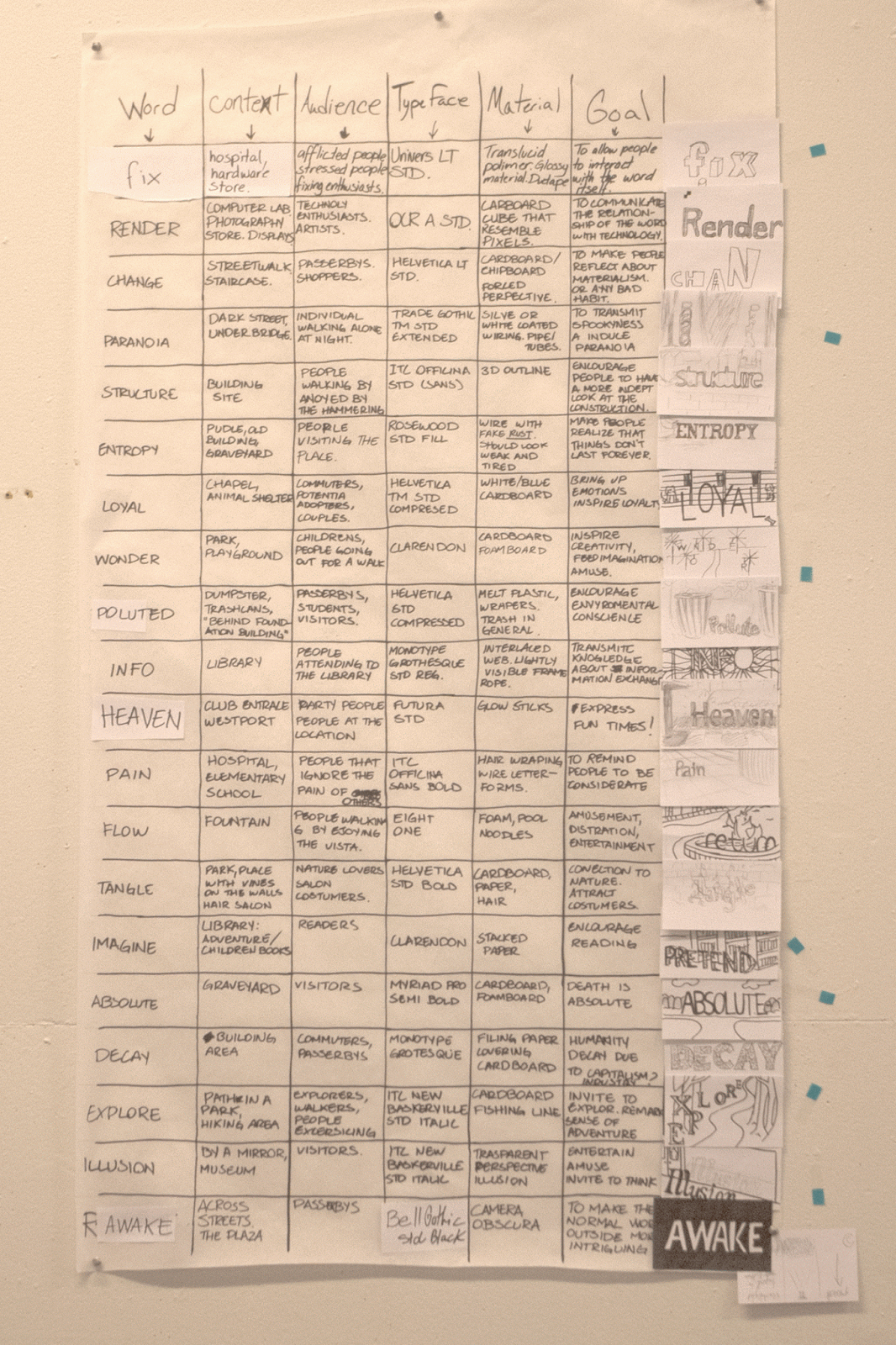
Here are all the words that we picked with their respective concepts. At the end of the class dicussion we came up with a few options to decide from. My partner and I decided to use the word Paranoia.


So we decided to use wire as the material for the construction. Here are some photos for the locations that we might want to use.


Final letter press post cards
These is the set of letterpress printed postcards. 2 Design alternating cards and two experimental. The concept of the design was to create the illusion of transparency by using contrasting type size and hierarchy as well as empty space. For the experimental we decided to uses a tone of gray to blend with the color of the paper and reinforce the concept of the design.


Monday, October 21, 2013
Viscom 1:3 Progress.
These is what I've got so far, they are vector based. The word that is constant between the three of the is dynamic, they all have very nice movement and entertain the eye effectively. Although they could use some finesse. I still have some scan and photo based options to pending to be made.


1 Color
These one seemed to be the most successful during the critique, it transmits it contents in a harmonic and clean way. Still some thought that a darker tint of green/blue would work better, so I will have to try that out and see how it goes.


3 Color
These one is my least favorite, even tho I tried to push the design the way it turned out to be seemed to aggressive from a marketable level. The way the pills where pouring down had somewhat of a implicit idea that isn't healthy for the costumer. I used a more traditional typeface while attempting to make the design elegant but I guess that it doesn't quite contrasts with the cheesy illustration.


Multicolor
This is my favorite out of the three. I feel like I pushed some design boundaries en ended up with a very nice looking piece. I think that the design looks very modern and sophisticated and transmits information in an organized and out of the ordinary thinking fashion. Some of the critics gave me some insight about simplifying some of the sides of the packaging and I agree with those so I'll look further in how to improve it.


Sunday, October 20, 2013
Final 3 book covers
Here are my final book covers, I enjoyed myself while trying to push my ideas out of the more literal concepts. I also ended up merging two concepts and elaborating something that I felt happy with.


The Two Kings
I decided to go for the symbol, which had a nice and intriguing look, it also conveys very important elements from the story in a symbolic way. This way I feel like I ended up with a very effective and attractive final piece, yet I still believe that it is open for improvement.
The Knife
I am very happy with the way I managed to create something completely new for this one. I believe that I was successful to create a very intriguing image which conveys ideas and emotions from the story in an unexpected yet entertaining way.

The Book of Sand
Even tho the assignment only demanded one option for these one, I just couldn't decide which one worked the best; so I'll have to leave it up to the critics. I am very pleased with the way that this two turned out, they contain the main ideas of the book in a combination of symbolism and expression that that inspire wonder and intrigue.


Subscribe to:
Posts (Atom)